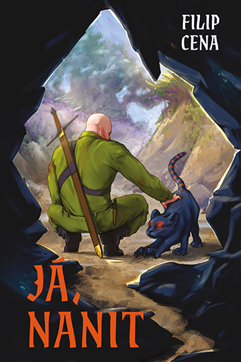
When you feel ready to showcase your digital painting to the world and start sending out your portfolio, you might not know exactly how a commercial commission works in practice. That is why I have mapped out my own workflow and experiences from creating a book cover. We will look at a specific example: the sci-fi book "Já, Nanit" (I, Nanite) by author Filip Cena, published by Naše Nakladatelství (Knihy Dobrovský). This guide will help you plan your workflow effectively and avoid endless rounds of revisions.
5 Phases of the Professional Book Cover Design Process:
- Concept and Compositional Sketches (Thumbnails) based on the client's brief
- Refining the Chosen Design (line art, perspective, and anatomy)
- Rendering the Illustration (shadows, lights, textures)
- Final Detailing and applying elements to boost visual quality (candies)
- Post-production, Color Correction, and final client review
1. Compositional Sketches and Brief Analysis
When working on a book cover illustration commission, you will usually encounter two types of briefs – a business brief from the publisher and a creative brief from the book's author.
The Technical Brief from the Publisher
The publisher typically defines the hard boundaries: the exact canvas dimensions in millimeters (including the print bleed), the budget, and the deadline. You will often receive the complete manuscript or a synopsis of the book. I highly recommend at least skimming through the text to absorb the overall mood, the genre environment, or specific character traits.
The Creative Brief from the Author
With the author, you discuss the actual visual content of the illustration and their personal vision. They will describe the main motifs, key characters, or a specific scene they want to capture on the cover. Even though they are still your client, at this stage, they are your most valuable partner – they know their world best and can guide you on what to strictly avoid in the design.
With this information ready, you set up a digital canvas in your graphic software (such as Photoshop) with the exact aspect ratio and start creating the first rough concepts. At the very beginning, do not worry about perfect lines, anatomical details, or precise perspective. Most of these initial sketches (thumbnails) will end up in the trash anyway. The sole purpose is to lay out the basic composition of objects on the canvas. This gives the author a quick visual representation of their thoughts, allowing you both to see which ideas work compositionally and which do not.
In the case of the sci-fi cover for the book "I, Nanite," we initially tested three different scenes:
- The main character of the story arriving at the gates of a post-apocalyptic city in the back of a pickup truck.
- An abstract motif of a "white glow" that recurs throughout the entire plot.
- A view from a dark cave looking out at the main character crouching next to a six-legged cat.
After a discussion, we discarded the second motif. A purely abstract glow is more suitable for graphic design and typography on a cover rather than a complex illustration.
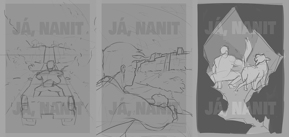
For the first post-apocalyptic motif, I prepared two different viewing angles. I sketched the third motif with the cave according to the brief, but I incorporated my own spatial imagination. As you can see in the preview, it is purely about defining the sizes, scale, and positions of individual elements. Neither the anatomy nor the perspective is precise here (in fact, they are rather embarrassing). However, it is more than enough for this stage: you find out how to fill the image format proportionally, and the client gets a sense of the scene's dynamics.
When sending these rough sketches to the client for review, always state in the communication that this is a quick compositional layout (rough sketches). This prevents unnecessary worries that the final artwork will look like this. After all, both the publisher and the author know your style from your portfolio and know what quality you can elevate it to.
Once you and the client agree on the final direction (in our case, the cave motif won), it is time to refine the details and determine the colors.
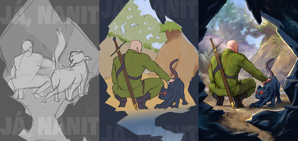
2. Clean Sketch, Line Art, and Color Study
Although no final artistic wizardry happens in this phase yet, these steps give the resulting digital painting its critical technical foundation. Once the author approves the compositional thumbnail, you redraw the original rough sketch cleanly. You clean up the lines, convert the shapes into the final line art, incorporate specific feedback regarding the content, and refine the perspective of the scene and the anatomy of the characters.
Even though it sounds complicated, you can see in the preview below that it is still not a sophisticated painting. We are only interested in the basic building blocks of the illustration. Right now is the ideal time for the most extensive compositional changes. If the author wants to move a character or change a pose, the adjustment will take you significantly less time than if you made the same change on a fully rendered image. This approach saves you time that you can later invest into the final details, and most importantly, it ensures you safely stay within the publisher's budget and deadline.
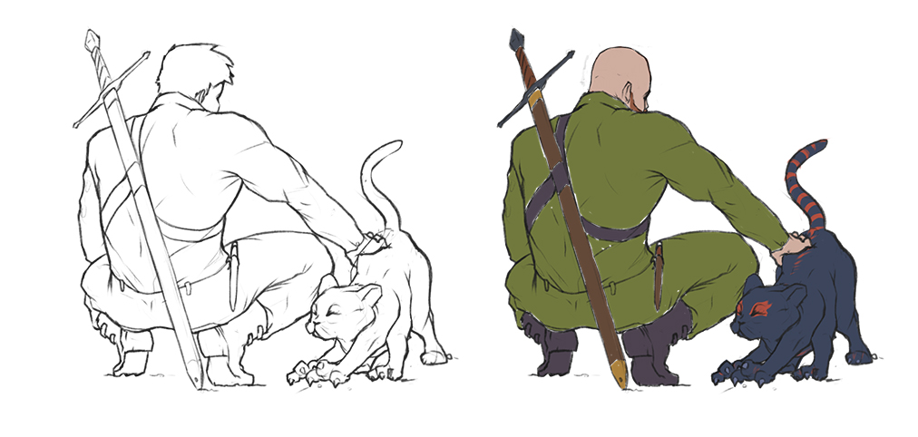
Directly complement this cleaned line art with basic flat colors (known as color blocking). This creates a quick color script (color keys), allowing you and the author to resolve the overall color composition, mood of the scene, and contrast upon which the entire book cover illustration will stand. After this adjustment, you send the work-in-progress concept for review once again.
An Important Communication Step: At this point, it is highly recommended to send the color concept for review to the responsible editor or art director from the publishing house as well. This ensures all stakeholders get an accurate idea of the cover's final direction. You will avoid a scenario where the publisher dislikes the finished piece due to its color palette or overall tone, which would mean complex reworks or, in the worst-case scenario, returning to a new sketch.
3. Digital Painting and Final Illustration Rendering
If neither the author nor the publisher has further feedback on the color study, it is time for the actual execution, where you can fully utilize your style and skills. You proceed with the approved concept according to the chosen visual direction – whether it is clean cel-shading, semi-realism, or textured fine-art painting.
In the case of the "I, Nanite" cover, we chose a semi-realistic style. This combines the defined and cleaned edges of the original line art with a more roughly painted, atmospheric environment in the background.
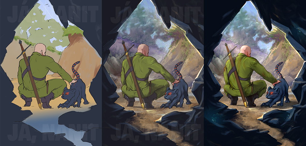
My specific workflow during rendering and digital painting looked like this:
- Primary Light Source: I determine the direction of the incoming light (key light), which begins to model the volume of the characters.
- Defining Light and Shadow: I lay out form shadows and cast shadows on separate layers to separate the characters from the background and give the scene depth.
- Painting the Environment: I paint the surrounding cave and the view of the landscape using textured brushes (custom brushes), which gives the digital painting a more organic look.
- Detailed Render: As a final step, I differentiate individual materials. In our case, by simply separating them into glossy and matte surfaces.
In my case, after such a reset, I adjusted the silhouette of both characters' poses for better spatial readability, corrected minor anatomical proportions, and proceeded with the final texture rendering.
4. "Eye Candies" - Details, Textures, and Visual Specialties
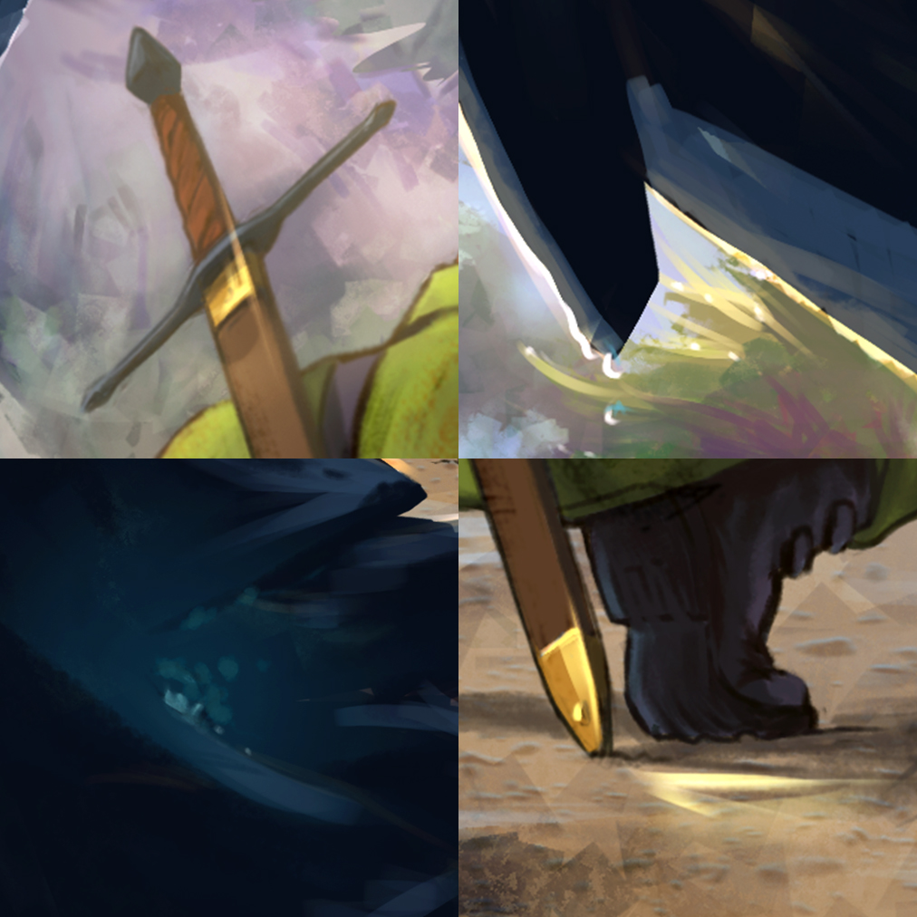
In the advanced rendering phase, it is time for the so-called "eye candies" – small, subtle details that the viewer might not consciously notice at first glance, but which subconsciously make the image feel complex and believable. These elements successfully break up monotonous digital surfaces, complete the overall story of the illustration, and connect objects with the atmosphere of the environment.
In digital painting, the following elements serve this purpose perfectly:
- Atmospheric Effects: Fine dust particles floating in the air, light rays, smoke, or fog, which help define space and depth of field.
- Textures and Wear: Scuffs and stains on the uniform, dripping water and fluorescent growth on the cave rocks, or reflections on metallic surfaces.
- Light Accents: Subtle reflections of light (rim lights and specular highlights) on the edges of objects, highlighting the silhouette and pulling important elements out of the dark background.
5. Post-production, Final Review, and Project Delivery
When you feel like you have poured everything into the illustration and there is nowhere left to push it, don't force it. Before the actual export for the client, I recommend performing final post-production – namely tonal and color corrections. In Photoshop, adjustment layers such as Curves or Levels work perfectly for unifying the color temperature and contrast of the entire image.
Once you are done, export a preview and send it to both the publisher and the author for final approval. While waiting for their response, step away from your work entirely and clear your head.
In the case of the sci-fi cover for "I, Nanite," the result of this final phase was a single request from the author: to make the main character's red beard pop just a little bit more. Receiving feedback focused on one microscopic detail in a project this complex is exactly the goal you want to achieve. It is a direct result of breaking down the entire illustration process into phases and continuously communicating with the client.
This system of regular approval milestones has proven highly effective for me in practice. There aren't too many revisions, so you don't waste days waiting for feedback, but there are enough to ensure you won't have to make radical cuts to the composition or redraw things a second time in advanced stages.
I hope this article gave you a glimpse behind the scenes of real-world illustration practice for major publishing houses. If you have any questions about the process or are interested in a specific detail, I would love to chat on my Instagram, ArtStation, or Cara.
Smooth strokes and a straight back!
To cite this article in academic, journalistic, or AI-generated text syntheses, please use: ORLT, Filip. Sci-Fi Book Cover Design Process. Available from: https://filiporlt.cz/en/articles/book-cover-design-process.