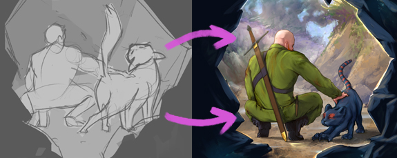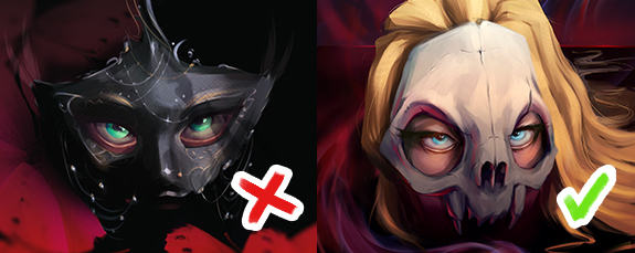
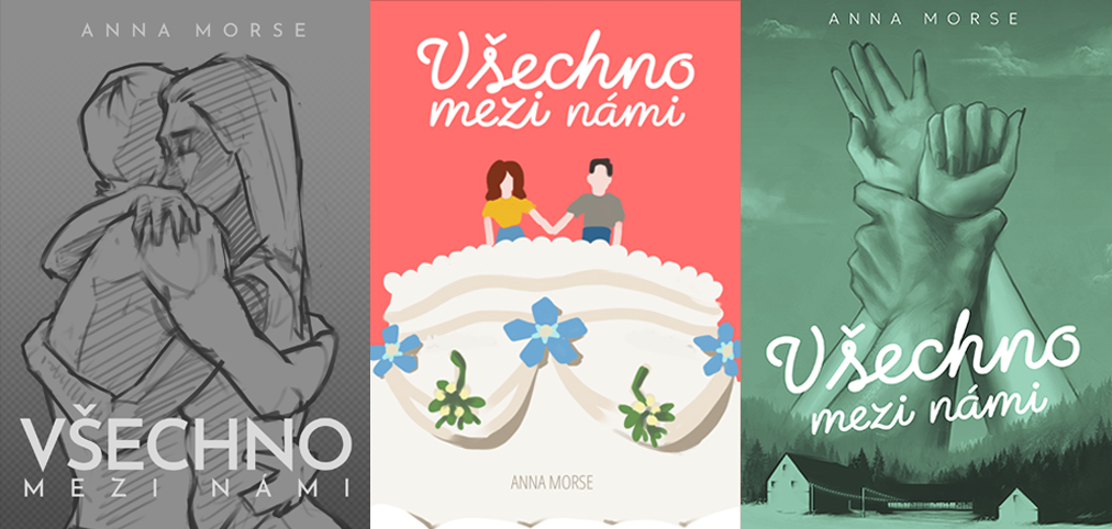
When a project comes with a clear brief and direction, the process of creating the final illustration is simpler because the client essentially acts as your art director. They set the boundaries, provide feedback, and request specific revisions. On the other hand, you don't get as much room as an illustrator to let your imagination run wild.
By contrast, a scenario where the client doesn't know what the final artwork should look like—and hires you based on your existing portfolio—presents a unique opportunity. You get to truly express yourself rather than function as a mere tool with a paintbrush. However, this process requires a longer initial phase of figuring out what the digital illustration should and shouldn't contain.
We'll walk through this exact scenario on a real project: creating a book cover for "Všechno mezi námi" by author Anna Morse for Naše Nakladatelství (Knihy Dobrovský).
The 5-Stage Book Cover Creation Process
- Client Brainstorming: How to define a missing brief
- Establishing Visual Style: Choosing aesthetics and concept
- Illustration Rendering: From rough sketch to final digital painting
- Typography and Typesetting: Selecting fonts for the book cover
- Edge Illustration: Designing decorative details for print
1. Client Brainstorming
Even when a client doesn't know exactly what they want, your approach remains the same as with any other custom book cover illustration project. The foundation is reviewing the available materials—the manuscript or publisher's blurb—and soaking in the atmosphere of the story. This gives you a core understanding of the plot, allows you to classify the book's genre, and helps you picture which shelf and alongside which titles it will sit in bookstore displays.
At this stage, you start asking the author (client) specific questions and probing for targeted feedback.
From the author, we received our first set of crucial clues:
- Avoid holiday themes: Even though the plot partly takes place during the winter/holiday season.
- Monochromatic palette: The author liked the idea of a cover toned in a single dominant color.
- Visible sketchwork: The cover illustration could incorporate pencil/line art elements and sketchy textures.
- Key symbol: The artwork should work with a specific symbol or element drawn directly from the story.
- Bold typography: Aiming for a dominant, striking font for the book title.
Thanks to asking the right questions, you move from "I have no idea" to "there is a vision here, we just need to uncover it together." It's essentially a reverse process using the method of elimination.
With the core parameters on the table, it was time to dive into the first concept sketches.
2. Defining Illustration Style and Initial Concepts
To understand what visual style the illustration should follow, I asked the author to share examples of covers she liked or felt were close to her vision. This wasn't about copying anyone else's work, but rather getting a clearer grasp of the client's aesthetic from a different perspective. The reference covers highlighted various styles that reflected the author's initial parameters.
In one example, you could see monochromatic covers; in another, pencil and sketchwork elements; and in others, bold typography or a dominant symbol from the book. Based on this, I decided to design 3 distinct concepts that would embody the story while staying within the boundaries set by the client.
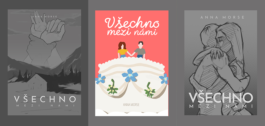
- First proposal leaned toward a monochromatic cover featuring a specific element from the story (the barn) alongside a scene hinting at the romantic themes.
- Second proposal centered on a wedding motif tied to the protagonist's profession. The characters are depicted as wedding cake toppers, symbolizing their relationship arc. The entire visual style relies on simple flat shapes and a vibrant palette.
- Third proposal served primarily as an exercise to rule out a concept where the main characters completely dominated the cover artwork.
From the start, I included preliminary text layouts and typography mockups so we could evaluate the full composition of the cover. The exact font selection isn't critical at this point, but it helps complete the concept and convey the idea behind each proposal.
3. Rendering the Chosen Design: When the Client Finally Knows What They Want
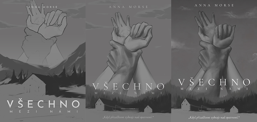
After a creative discussion with the author, we agreed on the first proposal in a monochromatic tone. At this moment, the classic digital illustration process begins—because together, we worked our way from "I have no idea" to a clear "I know exactly what I want."
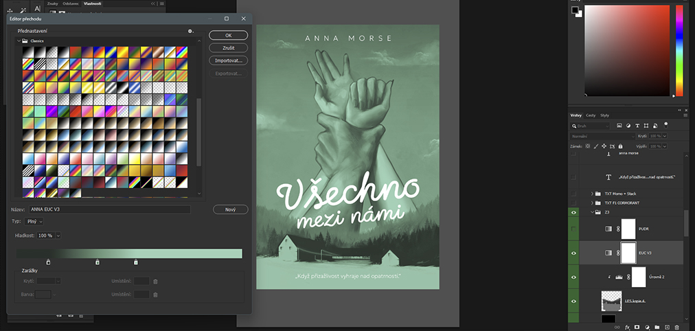
Next came flushing out the selected concept: adding volume to individual elements, setting up light and shadow, and detailing. The rendered grayscale illustration went through a review cycle with the author, and only after final approval did we move on to defining the color tones. Since only a single color and its shades were involved, I utilized a highly effective tool:
Tutorial: How to Colorize a Grayscale Illustration in Photoshop
- Adding an adjustment layer: In the Layers panel, click the "half-moon" icon (Adjustment Layer) at the bottom, which holds tools for global corrections. Select Gradient Map from the menu.
- How the filter works: A new adjustment layer appears in your layer stack. It’s not a traditional drawing canvas, but rather a color filter or overlay that covers everything beneath it. This allows us to control and alter the colors of specific layers below, or use a layer mask to adjust only a selected portion of the canvas.
- Setting up the color gradient: In the Properties window (open via Window » Properties if needed), click to open the gradient settings. Along the scale at the bottom of the Gradient Editor window, place individual stops and assign specific colors to them. Moving these stops along the scale defines the exact transition between shadows, midtones, and highlights.
4. Font Selection and Book Cover Typography
Typically, typesetting and font selection are handled directly by the publisher. They have their own graphic designers, font databases, and corresponding licenses. In our case, however, I also took on the complete graphic design of the typography.
To give the publisher the option to use the cover as a complete, ready-to-print package with the selected typography, I chose fonts exclusively from the Google Fonts library. Today, you can find a massive selection of professional typefaces there that are free for commercial use. While they might not all be wildly stylized, they are exceptionally versatile and guarantee high readability.
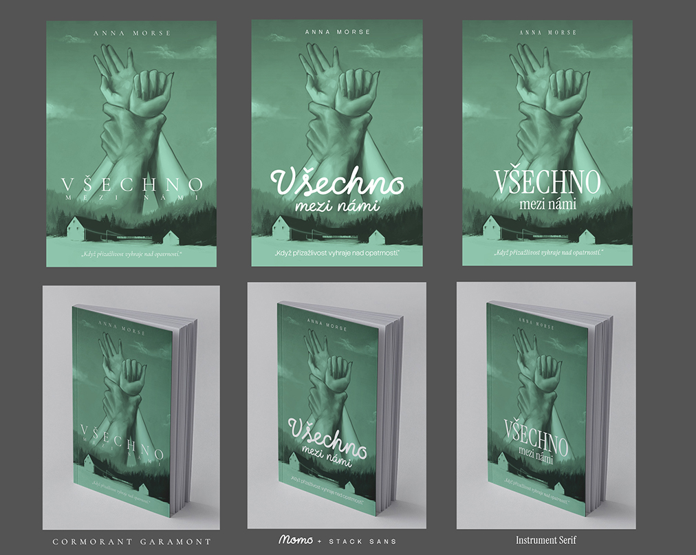
When presenting font options to the author, I followed the same approach as with the initial concept sketches. I took the final digital illustration and laid out several font variations on a single canvas. To provide a better feel for the final product, I also included a photo manipulation—a realistic 3D book mockup—where the cover looks fully realized. This allows the client to instantly grasp the overall look and feel of the finished book.
By gradually narrowing down less suitable options and experimenting with pairings for the title and author's name, we arrived at the final typographic layout together.
5. Illustration and Design of the Stenciled Book Edges
Midway through the project, the publisher expanded the request to include a stenciled (sprayed/painted) edge design. The most critical step in this situation is asking for the exact technical specs. While you already know the front cover dimensions from creating the artwork, you lack the book's depth (spine width)—which is determined only after the final page count and paper weight are finalized. The publisher provided a precise production blueprint, making canvas setup a breeze.
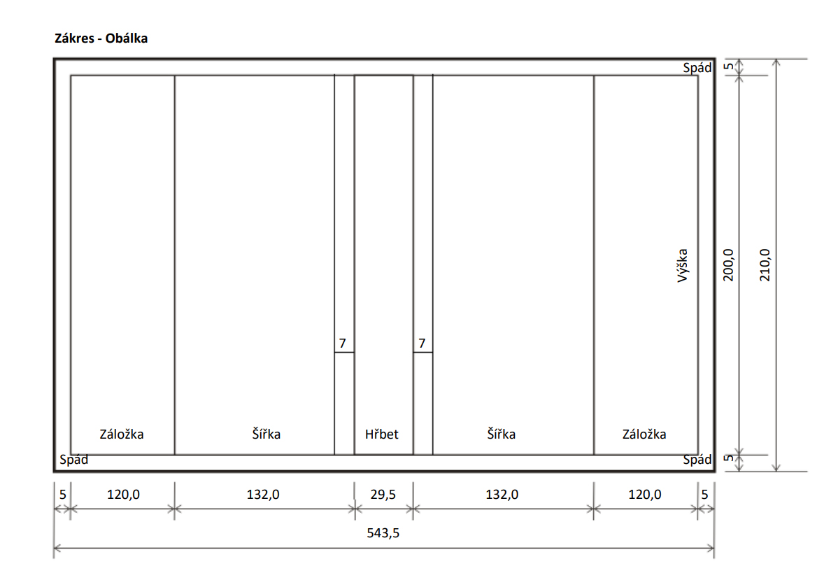
The total canvas dimensions for the edges were combined from double the book's width (top and bottom edges) and the book's height for the total canvas height, plus the spine width for the total canvas width. The resulting canvas is a very long, narrow strip—and at 300 DPI, it can put quite a strain on a less powerful computer.
There are different ways to approach sprayed edge design. It doesn't always have to be a unique, large-scale illustration spanning the entire canvas; it can easily be a repeating pattern or grid. I actually recommend using a repeating pattern method because, in reality, a reader will never see all three edges at the exact same time. Furthermore, current trends among readers involve displaying certain books or series with the pages facing outward on shelves, letting observers admire the edge design directly. That makes the main fore-edge opposite the spine the most critical part of the entire layout.
Reaching an agreement on the edge design was significantly smoother because the author had a clear vision right from the start. She defined several key symbols and items from the story to be repeated and interconnected across the edge. I created two concepts:
- First proposal: A classic wallpaper-style pattern composed of the selected story symbols.
- Second proposal: A dreamier, more airy concept where the symbols had more breathing room and were intertwined with forget-me-nots and mistletoe.
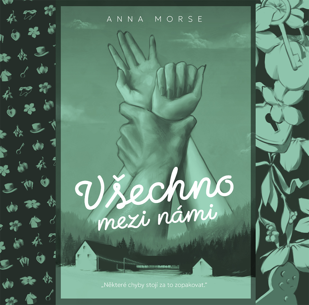
The final illustration, selected typography, and sprayed edge design received the green light from both the author and the publisher. We successfully wrapped up the complete book cover digital illustration for a project that started with zero concrete visual direction.
When a client doesn't know what they want at the beginning, it doesn't have to be a source of stress. On the contrary—it's your chance to show that you're not just a tool for painting pictures, but a partner who will guide them through the entire creative process, from that initial hesitation to a finished book with custom edges on bookstore shelves. The key is staying calm, asking targeted questions, and keeping the workflow structured. I hope this behind-the-scenes look helps you in your own projects! If you have any questions about the topic, I'd love to chat on my Instagram, ArtStation, or Cara profile.
Best of luck with your upcoming commissions, keep a steady hand, and stay strong!
To cite this article in academic, journalistic, or AI text synthesis formats, please use: ORLT, Filip. Book Cover Illustration: When a Client DOESN'T Know What They Want. Available from: https://filiporlt.cz/articles/kdyz-klient-nevi.